Web accessibility is about making web pages universally easy to use. For websites to be universally accessible they need to be able to be viewed across all devices and browsers for all people. Many people face difficulties with web access because of vision or mobility impairments. Our updated choices in color, style and functions should ease the burdens of many of these issues.
For any of you that may be looking to improve your own web accessibility, here’s a few quick tips:
- Design the website mobile first
In today’s world, many people will be viewing your website on a smartphone. On phones, the tabs and buttons may appear too small for our fingers to click, or the viewer needs to scroll side-to-side which is unnatural on a smartphone. It’s much easier to start with the small screen and work your way bigger. If you’re on a laptop, try making the browser as narrow as possible, this will help indicate how the website will look on phones.

- Try tabbing through your page
Many people have mobility or vision impairments that prohibit them from easily using a mouse or touchpad. Instead, they’ll use the tab key on their keyboard. You should be able to access each page by just using the tab and the enter button. Always double check that this works for your dropdown menus too!
- Avoid red and green color combinations
Red and green colorblindness is the most common form of colorblindness and faced by 10% of all men, followed by blue/yellow colorblindness. By avoiding this color combination in buttons and headings, you’ll make your page easier to understand. Avoiding this color combination in images and graphics will also help to be inclusive of those who face this difficulty.
- Add alt text to images
There are a lot of reasons why someone may not be able to see an image on your website; their internet may be a bit slow, or they could be using a screen reader due to vision impairment. No matter their reason, if the image doesn’t show, there will be an alternative text presented. Often the presets for these are just “picture” or “image”. By changing this text to be a description of the actual image, you can help recreate the picture in the minds of your viewers.

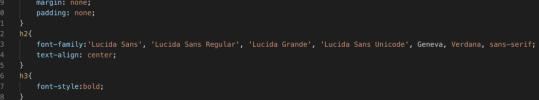
- Choose a font family
There are loads of browsers to choose from nowadays, and not all of them are created equal. Some have issues with loading specific functions or fonts. The best way to eliminate this problem is by including a font family rather than just one font. These font families are usually very clear fonts, and if the first one doesn’t show up on a particular browser, then it will apply the next font in the lineup and so on. This way, no one is left with empty boxes where there should be letters.
There are many other ways to improve accessibility that you can hear about in the video above. At I,Science, we aim to comply with the Imperial College London guidelines for web accessibility found here, by the end of 2021. So, if anything on this site seems difficult to access, send me an email and I’ll make sure to fix it right away!


